From the moment you step into a kitchen, color shapes how the room feels and functions. It’s not just style, but emotion and energy; something we at Hellings Kitchens & Baths understand deeply. By combining thoughtful kitchen color schemes with a grasp of color psychology, we help create spaces that blend timeless elegance and smart functionality, tailored to how homeowners want to live and feel.
How Color Impacts Mood in the Kitchen
Color psychology explores how different hues evoke emotional and mental responses. In kitchens, these reactions can influence everything from appetite to comfort.
– Red: Energetic and passionate, it stimulates appetite and conversation. This color is ideal for focal points or dining zones.
– Blue: Promotes calm, focus and a serene cooking environment.
– Yellow: Radiates warmth and optimism, but should be used sparingly to avoid visual fatigue
– Green: Symbolizes balance and harmony, connecting to nature and wellness, and giving kitchens a grounded, refreshing feel.
Incorporating these into kitchen color schemes allows you to craft spaces tailored to your emotional goals.
Using the 60 30 10 Rule to Create Balance
A foundational principle in color design, the 60 30 10 rule offers harmony and ease.
– 60% Primary surface: walls or major cabinetry
– 30% Secondary: island base, backsplash or flooring
– 10% Accent: hardware, décor, bar stools or open shelving
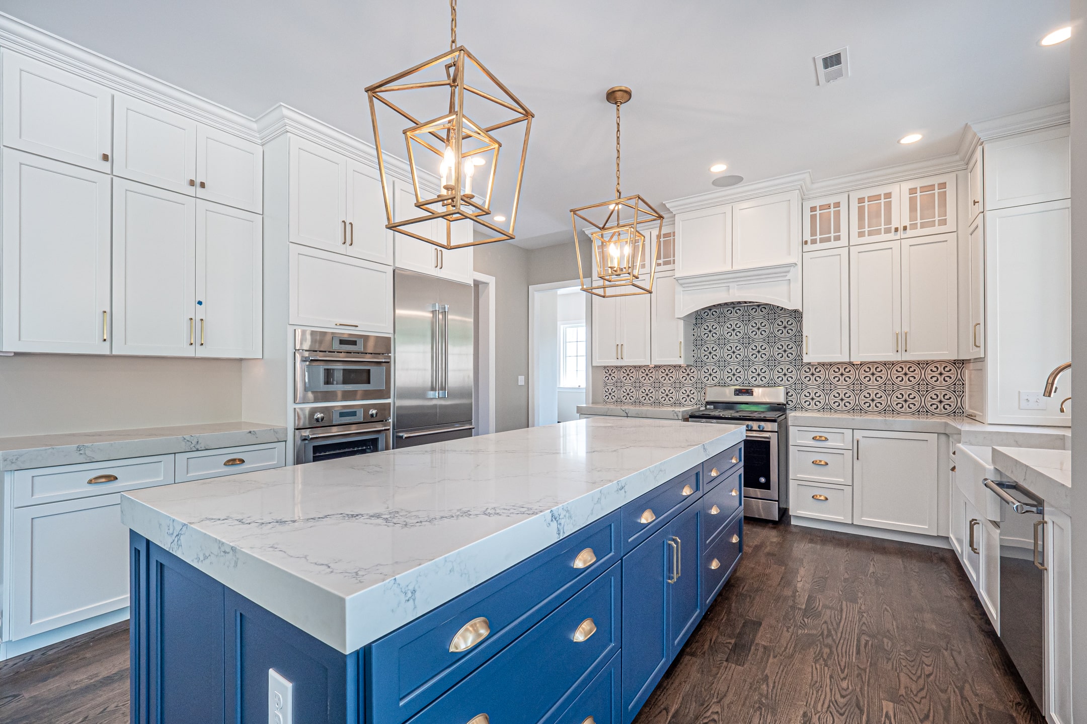
Want warm? Use a golden yellow base, white custom cabinets as secondary and terracotta accents. Prefer cool? Try navy primary, soft gray as secondary and mint accessories for pops of vibrancy.
The Role of Light and Layout in Choosing Color
Lighting dramatically affects how colors look: warm white under-cabinet LED gives depth; bright midday sunlight enhances warm tones while highlighting flaws in deep hues
Size and layout matter too. Small kitchens benefit from light hues that bounce light around; larger layouts can anchor deeper, richer tones without overwhelming the space
Always test samples at different times, because your perception shifts from breakfast to dinner light.
Matching Color to Purpose and Personality
Your kitchen should align with how you use it:
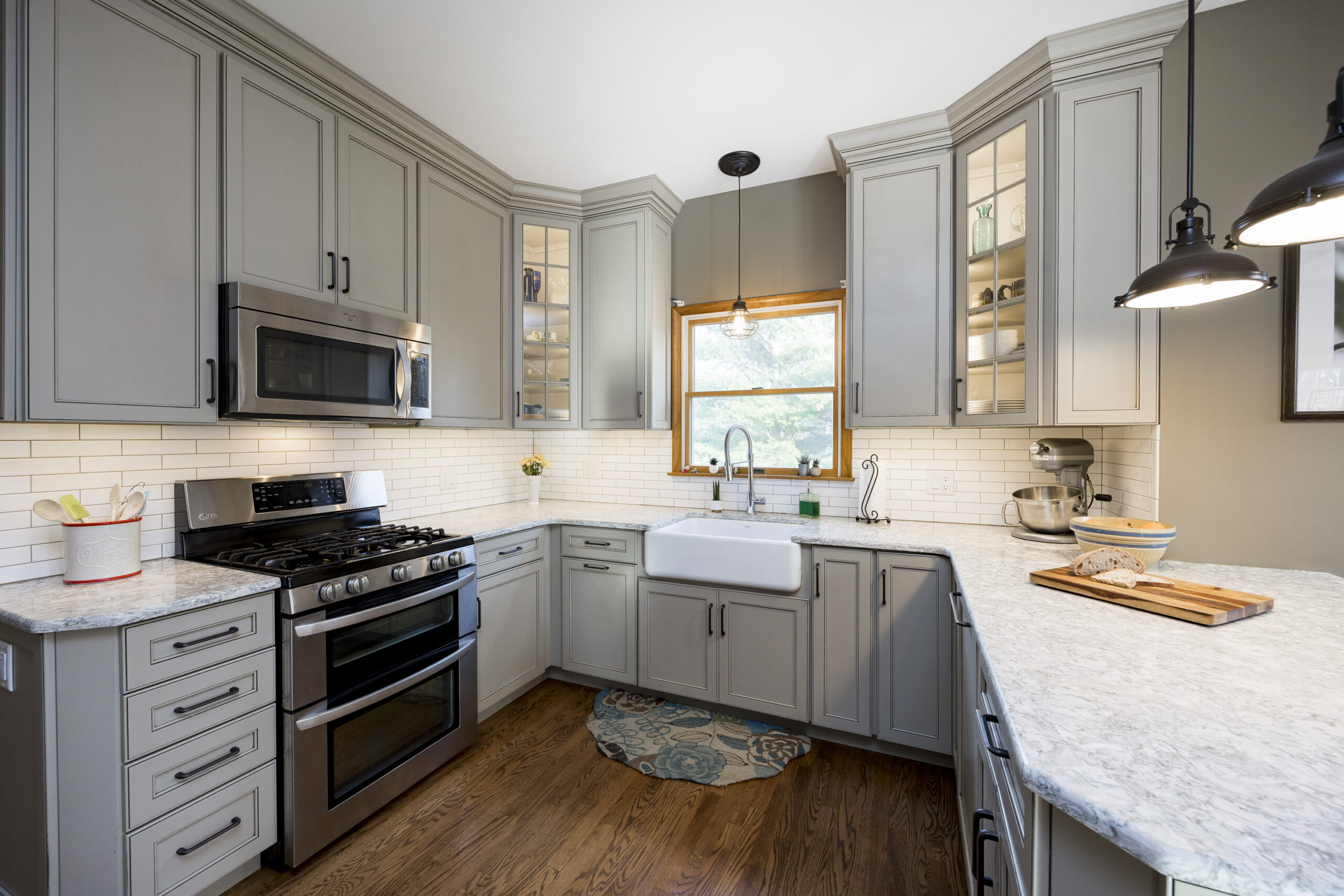
– Modern minimalist: Soft neutrals or grayscale palettes with pops of blue or green.
– Farmhouse/classic: Creams, sage green and mustard yellow for warmth and charm.
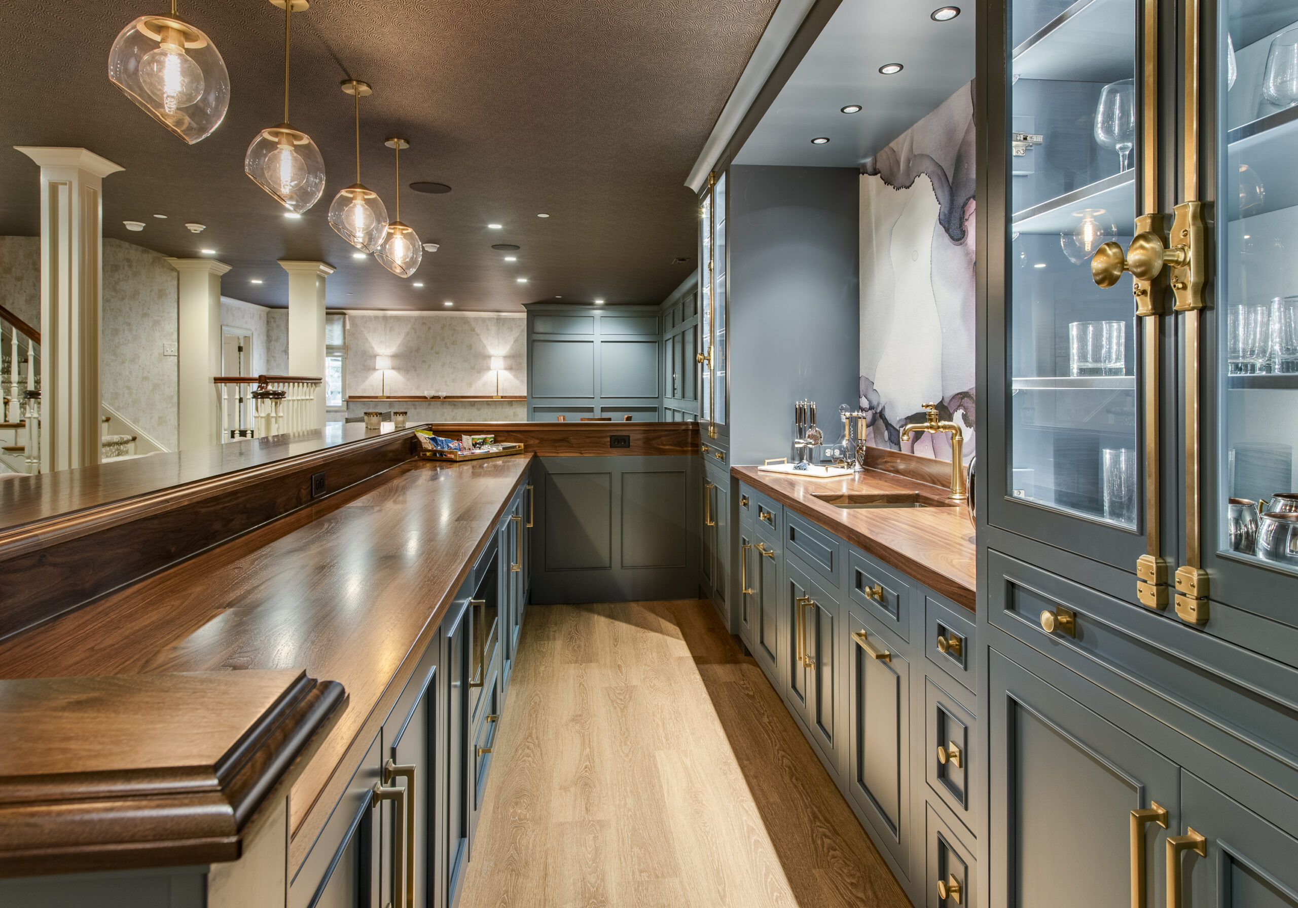
– Moody luxury: Deep navy, emerald or charcoal with metallic accents for drama.
Think about entertaining families or hosting quiet dinners. Kitchen color schemes should reflect lifestyle and personality, not just trends.
Pulling It All Together with Complementary Colors
Complementary or analogous palettes bring cohesion. Consider a navy cabinet paired with terracotta countertops and brass hardware. Or olive-green cabinets with a cream backsplash and rose-gold accents: nature-inspired, balanced, timeless
We guide clients to thoughtfully select cabinetry, quartz countertops, tile, paints and finishes so every surface speaks the same intentional language of color.
Final Touches That Make It Yours
Designing a kitchen is both science and art. Combining color psychology with balance, light, layout and purpose creates kitchens that are beautiful and deeply meaningful. At Hellings we help you through every selection ensuring your kitchen color schemes bring elegance and daily functionality into perfect harmony. Ready to explore how color can transform your home? Reach out to begin your personalized design journey.